Now we can create the components that will build your object type pages and dashboards. Components allow you to define how data is presented and interacted with on each page.
Components should be created after attributes and relations because they often reference them in various ways, including:
- Creating a text field (e.g., Ingredient description)
- Generating a diagram (e.g., Recipe recommendation graph)
- Adding a select box (e.g., Selecting which ingredients are used)
- Displaying tables, cards, or lists
- And many other UI elements
You can define components in two ways:
- Within the
componentsasset: This allows reuse across multiple object types and packages. - Directly in the page
template: Best for one-off components specific to a single object type or page.
For maintainability and clarity, defining components in the components asset is highly recommended. This keeps them organized and makes them easier to reference later.
Advantage: Ideal for reusable components referenced across object types.
"components": [
    {
        "key": "",
        "template": {
            "type": "component-type",
            ...
        }
    },
],Advantage: Useful for one-off components that are specific to a single page or an object type. However, for better clarity and maintainability, defining components separately is highly recommended.
"objectTypes": [
{
    ...
    "templates": {
        "main": {
            "centerArea": [
                {
                    "type": "component-type",
                    ...
                }
            ]
        }
    }
}
],
Component Structure and Template
Each component follows a simple structure.
- Assign a unique key, which will allow for the component to be referenced elsewhere in the package and other packages.
- Define the component in its
template.
In the template, you can define the component type and define its properties.
{
    "key": "component_key",
    "template": {
        "type": "component-type"
    }
},We recommend establishing and adhering to a naming convention for your component keys to ensure consistency and clarity. At Dawiso, we follow this format: componentType_useDescription
For example:
- table_recommendations for a simple table component.
- panel_table_recommendations for a table component nested within a panel. For more information on panels, see this section. Additionally, ordering components alphabetically makes it easier to navigate and reference them when working on your package.
The type determines the available properties for the component, and tooltips in the Dawiso editor will guide you through the options based on the selected type.
While there are many types of components, we will focus on the most commonly used ones in this article:
- Tables (API tables): Display structured data dynamically.
- Relations (tables and diagrams): Visualize connections between objects.
- Select boxes for users or objects (codetable labels): Assign predefined objects or users as labels.
See the full list of available components.
If you know your components will be used across applications, we recommend defining them in a separate package altogether.
Visual Component: Panel
Before creating individual components, it is important to consider their visual structure. The most used visual component in Dawiso is panel. Panels group related components and provide customizable headings. In some cases, they allow multiple components within one container, enabling additional functionality.
Example:
- A
section titlecomponent combined with an API table can include custom actions, such as anexport button. More on this functionality will be covered in future articles.
Wrapping components in a panel is highly recommended improved section separation and user experience.
Simply create a panel component and nest your component inside the values property. This ensures a clear layout and keeps related components grouped together.
{
    "key": "panel_component_key",
    "template": {
        "type": "panel",
        "title": "title.component_key",
        "values": [
            {
                "type": "component_type",
                "values": []
            }
        ]
    }
},
Example: Components in Our Recipe Manager App
Click here to show the example.
This section is optional and can be skipped. Its purpose is to simply demonstrate, using an example, how to identify the component types you need to create.
Let’s consider the components required for the Recipe Manager App. To keep everything consistent and organized, we will first list the components, assign them keys (if needed), and identify their types.
Components without keys are those defined directly in the templates properties of object types.
| Object Type | Component | Component Key | Component Type |
|---|---|---|---|
| Space App Overview | List of all objects | core#app_overview_table_generic | api-table |
| Cuisine | Table of Recipes | panel_table_recipes | api-table |
| Recipe | Table with recommendations | relations_table_recommendations | relations (table) |
| Recipe | Diagram with recommendations | - (Not needed) | relations (diagram) |
| Recipe | Right-side panel | ||
| Recipe | Contacts (Recipe Creator and Best Cook) | - (Not needed) | codetable-label-user |
| Recipe | Easy / Medium / Hard label | - (Not needed) | codetable-label |
| Ingredients Category | Table of Ingredients | table_ingredients | api-table |
| Ingredient Type | List of recipes table | relations_table_user_set | relations (table) |
| Ingredient Type | Relations Diagram | core#relations_diagram_generic | component |
| Ingredient Type | Right-side panel | ||
| Ingredient Type | Seasons label | - (Not needed) | codetable-label |
API Table Component
API tables display data dynamically based on API endpoints. They are highly configurable and can be tailored to meet your specific requirements. For more information, see the full list of configurable API table properties.
Let’s break down how to define the basic properties of an API table using a blank template.
{
    "type": "api-table",
    "tableId": "",
    "api": "",
    // "bulkEditable": true,
    "filter": { },
    "columns": [
        {
            "type": "",
            // "bulkEditable": true,
            "value": ""
        }
    ]
}| Property | Purpose |
|---|---|
type | The api-table component type creates a table where you can define both the data source and the data. |
tableId | A unique identifier for the table within the package. |
api | The API endpoint from which the table fetches data. The endpoint can be absolute or relative. Relative API fetches data from within the Dawiso system (e.g., api/mr-object/customizable-overview-filter). Absolute API allows integration with external data sources by providing a full API address. |
filter | (Optional) Filters are applied to narrow down the data displayed in the table. For more information, see the Filters article. |
columns | This property contains a set of JSON objects representing individual columns. Each column is configured using nested properties. |
Columns nested properties
- Column Type: Supported column types are:
definedKey: Attributes predefined by Dawiso, such asobjectNameorobjectPath. See the full list of defined keys.attributeKey: Custom attributes that have been created and assigned to objects, such asdescriptionorlabels.relationTypeKey: Displays related objects based on a specified relation type.userRelationTypeKey: Displays assigned users based on a specified user relation type.customActionButton: A button that triggers a specific POST request. For more information, refer to the API Table article.
- Value: Data type.
- For
definedKeys, pressctrl/cmd + spaceto see the full list of available values. - For
attributeKeys, provide the key of an attribute you created in the package like description, label, etc.
- For
Enabling bulkEditable for the table activates mass editing, allowing you to select multiple rows and update columns with the same value.
For more precise control, you can enable or disable bulk editing for specific columns.
Example: Ingredients Table
In the screenshot below, you can see an example API table. The table has mass (bulk) edit enabled (checkboxes next to individual rows).
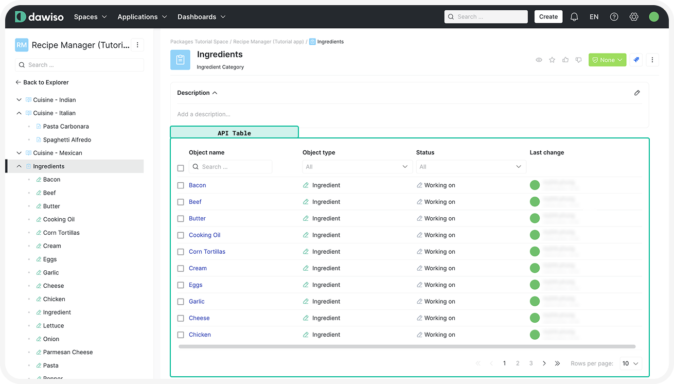 Click here to hide the example.The example table for the Ingredient Category was configured in the following way:
{
    "key": "table_ingredients",
    "template": {
        "type": "api-table",
        "tableId": "IngredientsTable",
        "api": "api/mr-object/customizable-overview-filter",
        "bulkEditable": true,
        "filter": {
            "parentObjectId": {
                "value": "@objectId"
            }
        },
        "columns": [
            {
                "type": "definedKey",
                "value": "objectName"
            },
            {
                "type": "definedKey",
                "value": "objectTypeName"
            },
            {
                "type": "definedKey",
                "bulkEditable": true,
                "value": "statusName"
            },
            {
                "type": "definedKey",
                "value": "lastChange"
            }
        ]
    }
},- API Endpoint: The api/mr-object/customizable-overview-filter API returns the list of all objects with the possibility to use a custom filter (in the next step).
- Filter: Limits the table to display only ingredients directly related to the parent object.
- Bulk editable: Allows bulk editing for the entire table, meaning users can select multiple rows and update their values at once. You can also specify which columns allow bulk editing.
- Columns:
objectName: The name of the ingredient.objectTypeName: The object type (e.g., “Ingredient”).statusName: The workflow status and specifies that bulk editing is enabled for the column.lastChange: The last modification date of the object.
Relations Component
The relations component displays connections between objects, providing a visual or tabular representation of their relationships. This component allows you to configure how relations are shown, which relations to display, and any associated attributes.
Here is the basic structure of a relations component:
{
    "type": "relations",
    "title": "",
    "elementType": "table",
    "values": [
        ""
    ],
    "attributes": [
        {
            "type": "",
            "value": "",
            "title": ""
        }
    ]
},
type
- The
relationscomponent type displays relations between objects, for example, as a list or a diagram.
title
- A title key added to translations, displayed above the component in the UI.
elementType
- Defines the visual representation of relations. Supported values include:
table: An editable table.diagram: An interactive diagram.static-table: A read-only table.grouped-list: A list of related objects grouped by relation type. This list is useful when we want the component in smaller places like the right-panel.
See the full list of supported element types.
values
- Specifies which relation types should be displayed by referencing their keys (e.g., “referencing”, or in our case “recommends”).
attributes
- Configures additional information to display alongside relations (e.g., attributes of related objects).
type: Type of the column value. Supported options are:attributeKey: For custom attributes defined in your package.definedKey: For predefined attributes available in Dawiso (e.g.,objectName,lastChange). See the full list of supported defined keys.
value: The specific attribute to display. For defined keys, pressCtrl + Space(Cmd + Spaceon Mac) to see the full list of available keys.title: The column name for the attribute. Create a key to add to translations.
This article is applicable for relations that use predefined diagrams. Customizable diagrams are also possible, we will cover those in more advanced tutorials.
Example: Table with Recipes Using the Ingredient
In the screenshot below, you can see the relations component as both a table, and a diagram.
Click here to show the example.
The example relations components for an Ingredient were configured in the following way:
{
    "key": "relations_table_user_set",
    "template": {
        "type": "relations",
        "title": "template.section_title_relations_all",
        "elementType": "table",
        "values": [
            "contains",
            "used_in"
        ],
        "attributes": [
            {
                "type": "definedKey",
                "value": "toObjectName",
                "title": "title.recipeNameColumn"
            },
            {
                "type": "definedKey",
                "value": "toParentObjectName",
                "title": "table.ingredientUsedIn.recipeCategory"
            },
            {
                "type": "definedKey",
                "value": "toSpaceName"
            },
            {
                "type": "definedKey",
                "value": "toApplicationName"
            },
            {
                "type": "definedKey",
                "value": "toObjectTypeName"
            }
        ]
    }
},In our example, we will also use a diagram with relations, which doesn’t need to be defined as we will use a core one using the core_relations_diagram_generic key.
Codetable Label and User Codetable Label
Codetable labels allow users to assign multiple or single-choice selectors to objects. They are typically used for categorization or ownership purposes and there are two main types:
- Codetable Label: Allows selecting other object types as labels.
- User Codetable Label: Allows assigning users within the app to the object.
Let’s take a look at the blank tables for these components:
Blank Template
{
    "type": "codetable-label",
    "values": [
        {
            "objectTypeKey": "",
            "relationTypeKey": "",
            "title": ""
        }
    ]
},
The codetable-label components creates a label select box.
Nested properties in values:
JSON objects representing individual label selectors, consisting of:
objectTypeKey: Specifies which object types can be selected as labels.relationTypeKey: Determines the relation created between the labeled objects (e.g., “is referencing”). For custom relation types (e.g., “contains,” “is used by”), see the 3. Define Smallest Units: Relations and User Relations article.title: (Optional) Provides a custom display name for the label in the UI. If not defined, the relation name will be used.
Adding a title property for codetable labels improves clarity and usability in the UI, helping users quickly understand the label’s purpose. For example, instead of displaying a relation name like “requires”, a more user-friendly label such as “Ingredients Used” provides better context.
{
    "type": "codetable-label-user",
    "values": [
        {
            "userRelationTypeKey": ""
            "title": ""
        }
    ]
},
The codetable-label-user components creates a user selection box. This allows assigning users to an object, which can but doesn’t have to affect workflows.
Nested properties in values:
JSON objects representing individual user selectors, consisting of:
userRelationTypeKey: Determines the relation between the object and selected user. For custom user relation types (e.g., “Data Owner,” “Recipe Owner”), see the 3. Define Smallest Units: Relations and User Relations article.title: (Optional) Provides a custom display name for the user label in the UI. If not defined, the user relation name will be used.
While it is technically possible to add multiple values within a single codetable label, we recommend using a panel to group multiple codetable labels (also possible along with other relevant attributes). This improves organization and readability. For more information on panels, refer to the Visual Component section.
Example: Selectors in Recipe Manager App
In the screenshot below, you can example codetable labels: both for objects, and user relations.
Click here to show the example.
In our example app, both label types will be used. If these were defined in the components asset, they would need a key. For demonstration purposes, these components will be defined directly in the example package.
A codetable label assignsingredients (the object type) as labels to a recipe.
{
    "type": "codetable-label",
    "values": [
        {
            "objectTypeKey": "core_code_lists#label",
            "relationTypeKey": "core_code_lists#has_label"
        }
    ]
}
A user codetable label allows assigning Recipe Owner and Best Cook users to a recipe.
{
    "type": "codetable-label-user",
    "values": [
        {
            "userRelationTypeKey": "recipe_owner",
            "title": "title.recipeOwner"
        },
        {
            "userRelationTypeKey": "best_cook",
            "title": "title.bestCook"
        }
    ]
}