The templates property of an object type allows you to:
- Define what information is displayed on the main object type page using attributes and components.
- Configure the object detail panel, which appears when you click on an object in the advanced search results, diagrams, or other areas with limited space.
Templates define which attributes and components appear in specific areas of an object’s page.
Templates define the layout and content of a page. Depending on the use case, this property can be applied for different assets:
- objectType: Configures the layout of each object type’s page and the object detail view.
- applications: Configures the layout of the application overview page, accessible by clicking the application name in the Applications tab of the top navigation bar. This will be covered in more detail in the 7. Define the Application article.
- pages: Configures a dashboard. Dashboards, accessed through the Dashboards tab in the top navigation bar, will be covered in their own article. Pages are typically organized in a separate package exclusively for dashboards, as they require a distinct set of components.
Here is a blank templates property for an object type:
"objectType": {
    "key": "",
    "name": "",
    ...
    {
        "templates": {
            "main": {
                "centerArea": [
                    {
                        "type": ""
                    }
                ],
                "rightArea": [
                    {
                        "type": ""
                    }
                ],
                // "settings": {}
            },
            "objectDetail": {
                "area": [
                    {
                        "type": ""
                    }
                ],
                // "settings": {}
            },
            "search": { },
            "miscellaneous": { }
        }
    },
    ...
},| Property | Purpose |
|---|---|
main | Configures the layout of the main object page using attributes and components. Every object type page can be split into two sections: centerArea: The center area is usually used for big components like long descriptions, tables, or diagrams., rightArea: (Optional) The right panel is often used for labels or label selectors. Defining this area is not a requirement for all object types., settings: (Optional) This property configures settings specific to the object type template. Find more details in the section on Template Settings. |
objectDetail | Defines the object detail panel, which shows up when we select an object in e.g., advanced search, diagrams, or other limited spaces. Please note that the object detail template supports only the following component types: api-table, attributes, codetable-label, codetable-label-user, component, panel, relations, section-title, tabs |
search | Configures which attributes of this object type can be used as search facets. This will be covered in more detail in advanced tutorials. |
miscellaneous | Adds a button with a link to the main page and object detail page. For more information, see the article on the Object Type Miscellaneous property. |
Using Templates to Add Attributes and Components
In the templates property, you specify the placement of attributes and components created for the object type. The order in which they are listed in the templates property determines how they are displayed in the UI.
- Attributes: Adds data fields to the page, such as text boxes, checkboxes, or date pickers.
- Components: Adds UI elements like tables, diagrams, or labels.
The order of attributes and components in the templates property is critical. The UI will render them in the sequence they are listed, so plan the arrangement carefully to ensure the page layout is intuitive.
We will take a look at dashboards and their unique components more in detail in a future article on dashboards and templates.
In the screenshot below, you can see our example application’s Recipe object type template. This template has both a center and a right area and in each, you can see the relevant components.
1. Attributes
When you assign an attribute to an object type, you define the kind of data that can be stored. However, to make this data accessible and editable in the UI, you must include the attribute in the page layout.
For example, adding an attribute with is_html feature to the layout ensures that a text editor appears, allowing users to input and manage the data.
{
    "type": "attributes",
    "values": [ ]
},
Example: Recipe Object Type’s Attributes
Click here to hide the example.
”objectTypes”: [
{
“key”: “recipe”,
…
“attributeTypes”: [
{ “key”: “recipe_steps” } // Assigning the attribute type allows us to enter and store data.
],
…
“templates”: {
“main”: {
“centerArea”: [
{
“type”: “attributes”,
“values”: [ “recipe_steps” ] // Adding the attribute type to the template displays the field on the object type page.
},
…
        }
    }
},
],
2. Referencing Components
Reference previously created components by their keys using the "type": "component" property and specifying the corresponding component key (from 4. Define Smallest Units: Components) in the value field.
{
    "type": "component",
    "value": ""
},
Example: Cuisine Object Type’s Components
Click here to hide the example.
”components”: [
{
“key”: “panel_table_recipes”,
…
},
],
…
“objectTypes”: [
{
“key”: “cuisine”,
…
“templates”: {
“main”: {
“centerArea”: [
…
{
“type”: “component”,
“value”: “panel_table_recipes”
}
        }
    }
},
...
],
3. Creating Components
Components can be defined directly within the layout, mainly for those that are not reused. While we generally recommend defining all components in their own asset for better organization and reusability, direct component creation within templates would look like this:
"templates": {
    "main": {
        "centerArea": [
            {
                "type": "",
                "title": "",
                "values": [ ]
            }
        ],
    },
    ...
}
Example: Recipe Object Type’s Components
Click here to hide the example.In our example app, we will define the components for the Recipe object type page template in the following way:
"objectTypes": [
    {
        "key": "recipe",
        "name": "Recipe",
        ...
        "templates": {
            "main": {
                "centerArea": [ ... ],
                "rightArea": [
                    ...
                    {
                        "type": "panel",
                        "title": "title.recipeIngredientsList",
                        "values": [
                            {
                                "type": "codetable-label",
                                "values": [
                                    {
                                        "objectTypeKey": "ingredient",
                                        "relationTypeKey": "contains",
                                        "title": "title.usedIngredientsLabel"
                                    }

                            }

                    }

            }
        }
    },
    ...
]
You can nest components within visual components for better organization and clarity. In our example, panel components wrap codetable labels into structured sections, improving readability. For more details, see the Visual Component: Panel section in the 4. Define Smallest Units: Components article.
Optional: Object Detail
Object detail is the preview of the object displayed in the right-side panel, search results, or other areas with limited space.
When not configured, the object detail will contain information from the center area of the object template, provided they belong to the following component types:
- �PLACEHOLDER0�
- �PLACEHOLDER0�
- �PLACEHOLDER0�
- �PLACEHOLDER0�
- �PLACEHOLDER0�
- �PLACEHOLDER0�
- �PLACEHOLDER0�
- �PLACEHOLDER0�
- `
tabs
Here is a blank object detail template:
"objectDetail": {
    "area": [
        {
            "type": ""
        }
    ],
    "settings": { }
}| Property | Purpose |
|---|---|
area | Configures the object detail layout by adding new components or referencing existing ones, just like the center and right areas of the main object type template. To further structure and categorize the content, we recommend using the tabs visual component type. Each tab can display different attributes and components, as they are defined separately. |
settings | Specifies the settings specific to the object detail template. For more information, see the section on Template Settings. |
Example: Recipe Object Type’s Object Detail
In the screenshot below, you can see the object detail of a Recipe object type.
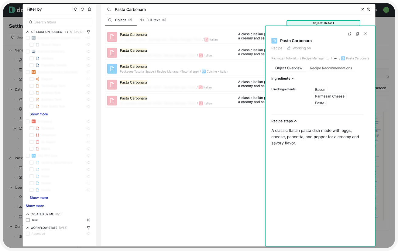 Click here to hide the example.For the Recipe’s object detail, we configured two tabs:
- Object Overview Tab: Contains the list of ingredients and the recipe description.
- Recommended Recipes Tab: Displays a list of recommended recipes.As you can see, we simply reused existing components for convenience.
"objectTypes": [
    ...
    {
        "key": "recipe",
        ...
        "templates": {
            "main": { ... },
            "objectDetail": {
                "area": [
                    {
                        "type": "tabs",
                        "values": [
                            {
                                "title": "title.objectDetail.overview",
                                "values": [
                                    {
                                        "value": "codetable_label_ingredients",
                                        "type": "component"
                                    },
                                    {
                                        "type": "attributes",
                                        "values": [
                                            "recipe_steps"
                                        ]
                                    }
                                ]
                            },
                            {
                                "title": "title.contacts_and_recommendations",
                                "values": [
                                    {
                                        "type": "panel",
                                        "title": "recommendations",
                                        "values": [
                                            {
                                                "value": "relations_table_user_set_recommendations",
                                                "type": "component"
                                            }
                                        ]
                                    }
                                ]
                            }
                        ]
                    }
                ],
                "settings": {
                    "type": "component",
                    "value": "object_detail_settings"
                }
            }
        }
    },
...
],
Optional: Template Settings
Each object type and object detail template includes default UI components, such as the comment section, changelog, and like/dislike buttons. These components are visible by default but can be configured to suit your needs.
Layout settings are often reusable for multiple object types (e.g., all folder-like object types will have the same layout), which is why you should consider defining them in the components asset.
If reused across applications (e.g., same layout for object types of scanned applications), define these settings as components in their own package.
Let’s take a look at a blank settings template:
"settings": {
    "type": "template-settings",
    "attributeLayout": "",
    "header": {
        "descriptionAttributeTypeKey": "",
        "layout": ""
    },
    "layout": "",
    "hide": {
        "anchors": true/false,
        "attachments": true/false,
        "changes": true/false,
        "commentSection": true/false,
        "concepts": true/false,
        "created": true/false,
        "editButton": true/false,
        "favouriteButton": true/false,
        "hideEmptyAttributesButton": true/false,
        "jiraSearch": true/false,
        "likeButton": true/false,
        "moveObject": true/false,
        "removeObject": true/false,
        "renameObject": true/false,
        "shareObject": true/false,
        "updated": true/false,
        "watchingButton": true/false,
        "workflowStatus": true/false
    }
}| Property | Purpose |
|---|---|
type | The templates-setting component type configures the settings of a page layout. When defined as a separate component, it will also need its own unique key for referencing. |
attributeLayout | Determines how attributes and their values are displayed on the page. Supported values are: multiline: Attribute type and value are on a separate line., single-row: Default value. Attribute type and value are on the same line. |
header | Configures the header area of the object page: descriptionAttributeTypeKey: Includes a description stored in an attribute., fullnessAttributeTypeKey: Adds a fullness score, which provides a visual metric for completeness., layout: Configures the header’s appearance. Supported values are:, default: Header contains like/dislike, favorite, and watch buttons, workflow state, fullness score, etc., documentation: Removes the header for a wiki-like layout with only the object name, creation timestamp, last updated timestamp, author, and workflow state visible. |
layout | Determines the overall appearance of the object type page: default: Components are in panels with borders., single-row: Removes borders around panels on the page. |
hide | Specifies which UI components should be hidden. If a component is not explicitly listed, it will be visible by default (false). Components that can be hidden are: anchors: Removes heading anchors., attachments: Disables adding attachments., changes: Hides the change history section., commentSection: Disables the comment section on the page., concepts: Disables creating concepts., created: Hides the information about who created the object., favouriteButton: Disables the option to mark the object as a favorite., hideEmptyAttributesButton: [Obsolete] Hides empty attributes., jiraSearch: When the Jira integration is enabled, removes the button that looks the object up in Jira., likeButton: Disables the like/dislike button for the object., moveObject: Hides the option to move the object to a different location from the object settings., removeObject: Disables the option to delete the object., renameObject: Disables the ability to rename the object., shareObject: Disables the object share option., updated: Hides the information about who last updated the object., watchingButton: Disables the button to follow/watch changes to the object., workflowStatus: Removes the workflow status. |
Example: Template Settings on Cuisine Object Type
In the screenshot below, you can see what the template settings can influence:
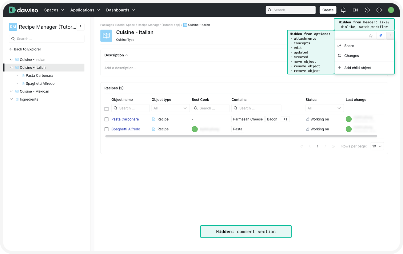 Click here to hide the example.In our example package, the template settings were used for the parent object types (Cuisine and Ingredients Category) and were defined as a component:
"components": [
    ...
    {
        "key": "parent_object_settings",
        "template": {
            "type": "template-settings",
            "rightPanelClosed": false,
            "hide": {
                "attachments": true,
                "changes": false,
                "commentSection": true,
                "concepts": true,
                "editButton": true,
                "favouriteButton": false,
                "hideEmptyAttributesButton": true,
                "shareObject": false,
                "watchingButton": true,
                "workflowStatus": true,
                "likeButton": true,
                "anchors": true,
                "updated": true,
                "created": true,
                "moveObject": true,
                "renameObject": true,
                "removeObject": true,
                "jiraSearch": true
            }
        }
    }
],
...
"objectTypes": [
    ...
    {
        "key": "cuisine",
        ...
        "templates": {
            "main": { ... },
            "objectDetail": {
                "area": [ ... ],
                "settings": {
                    "type": "component",
                    "value": "parent_object_settings"
                }
            }
        }
    },
...
],