Data markets are a type of dashboards that provide users with a curated catalog of data assets to support data discovery. You can configure personalized recommendations, search capabilities, and customizable filtering. In this tutorial, we will create a data market for our Recipe Manager created in Writing a Data Ingestion Application Package.
A data market allows us to:
- Search functionality with customizable queries and indexes
- Recommendation system that suggests relevant objects to users
- Search forms with faceted filters for refined searching
- Custom page with a marketplace-style interface
The example packages used in the tutorial are the following:
| Base Package Example | Download the full examples we used in this tutorial to follow along: - Recipe Manager (version data ingestion): Recipe Manager (Metadata Application).json - SQL script with the example database: Recipe SQL Script.sql |
|---|---|
| Data Market Package Example | Recipe Manager (Data Market).json |
 |
Package Settings
First, let’s configure the package to enable the creation of a data market by adding global settings and dependencies:
"settings": {
    "createAssetMappingsForExistingAssets": false,
    "search": [
        {
            "isSearchable": true,
            "description": "Data Market for Recipes",
            "applicationKey": "cust_recipe_metadata_app_app",
            "objectTypeKey": "cust_recipe_metadata_app_recipe",
            "functionKey": "mr_object_import_func",
            "indexKey": "search_index"
        }
    ]
},
"dependsOn": [
    { "packageKey": "core" },
    { "packageKey": "cust_recipe_metadata_app" }
],| Property | Description |
|---|---|
isSearchable | Enables search functionality for this configuration. |
description | Description of the search configuration for internal documentation. |
applicationKey | Key of the application with objects included in search results. |
objectTypeKey | Key of the object type that will be searchable in the data market. |
functionKey | Key of the import function, which defines what is imported into the search. For our package, we used mr_object_import_func for the search to look up objects. For other function keys, see Search (Package Settings). |
indexKey | Key of the search index that will be used for this search configuration. You can use the key of an existing index. |
dependsOn | Using this JSON object, define what packages must be installed first. If you are also defining an application in the same package, only the core package should be specified. |
Search Query and Index
We will go through the configuration of search queries and index briefly. For more information, see the tutorial on Search Area Configuration.
You can also skip this part and use queries and indexes defined in other packages or use the ones provided in the example package.
Search Queries
Search queries define how search terms are processed and matched against indexed data. Queries are defined using the following template:
"searchQueries": [
    {
        "key": "",
        "searchQueryTypeKey": "",
        "description": "",
        "searchQuery": ""
    }
],| Property | Description |
|---|---|
key | Unique identifier for the search query, referenced by search forms. |
searchQueryTypeKey | Type of query: empty, basic, or advanced. |
description | Internal description of the query’s purpose. |
searchQuery | ElasticSearch QueryDSL definition. Uses placeholders like __searchTerm__, __permissionPart__, __facetsPart__, and __filterPart__. |
| Typically, three types of queries are defined: |
empty: Used when no search term is provided or when showing all results.basic: Standard text search with fuzzy matching and basic ranking.advanced: Advanced search with operator support (AND, OR) and precise matching.
The data market package uses predefined ElasticSearch QueryDSL queries. We recommend using these standard queries as provided in the example package unless you have specific search requirements.
Search Index
The search index is a reference to the ElasticSearch index that stores searchable object data. It acts as a pointer to where the search queries will look for data.
A new search index is created using this template:
"searchIndexes": [
    {
        "key": "search_index",
        "indexName": "search_index"
    }
],| Property | Description |
|---|---|
key | Unique key used to reference this index in search forms and package settings. |
indexName | Name of the ElasticSearch index (must be lowercase). |
After installing a package with a new search index, make sure to go to Settings > General and click Refresh index.
Search Form
While the search query and index can be referenced from other packages, the search form must be configured specifically for the data market.
Search forms define the search function and facets (filters) that will be selectable on the data market dashboard. Let’s start with a blank template:
"searchForms": [
    {
        "key": "",
        "state": "",
        "searchIndexKey": "",
        "orderNumber": 0,
        "iconKey": "",
        "searchQueryKeys": [],
        "template": {
            "formId": "",
            "title": "",
            "defaultFacets": [],
            "sort": []
        }
    }
],| Property | Description |
|---|---|
key | Unique identifier for the search form, referenced by page components. |
state | Visibility state of the search form. Use hidden for data markets to hide it from the Advanced search. |
searchIndexKey | Key of the search index this form uses for queries. |
orderNumber | Display order when multiple search forms exist. Important only when the state of the form is active. |
iconKey | Icon displayed with the search form in the UI. Important only when the state of the form is active. |
searchQueryKeys | Array of search query keys that this form will use (typically: empty, basic, advanced). |
template | Contains the UI configuration including facets and sorting options. |
Template Properties
| Property | Description |
|---|---|
formId | Internal identifier linking the template to the search form. |
title | Translation key for the form’s display title. |
defaultFacets | Array of facet configurations that allow users to filter search results. |
sort | Array of sorting options available to users. |
Default Facets
Facets are filters that allow users to narrow down search results based on various criteria. For all available types, see Default Facets.
Each facet configuration follows this structure:
"defaultFacets": [
    {
        "type": "faceted-element",
        "enumKeyType": "",
        "enumKey": "",
        "title": "",
        "elementType": "",
        "valueType": "",
        "orderBucketsType": "",
        "iconKey": "",
        "values": [ "" ]
    }
]| Property | Description |
|---|---|
type | Always faceted-element for standard facets. |
enumKeyType | Type of data being faceted. Common values: objectType, userRelation, relation, attribute. |
enumKey | Specific key identifying what to facet on. |
title | Translation key for the facet’s display label. |
elementType | UI element type, e.g., a select box. |
valueType | Data type of facet values (text, number, value provided by the translation key). |
orderBucketsType | How to sort facet options: value (alphabetically), count (by result count). |
iconKey | Icon displayed next to the facet in the UI. |
values | Array of specific values to include in this facet filter (translation keys for object types). |
By selecting different combinations of enumKeyType, elementType, and valueType, you can create different kinds of facets to suit your data market needs. |
The Recipe Manager data market demonstrates four common facet patterns that work together to create a complete filtering experience. Let’s examine each one:
Facet 1: Object Type Filter (Base Filter)
This facet defines which object types are shown in the data market. It acts as the foundation and all subsequent facets are based on the objects selected by this facet.
It restricts the entire data market to only show Recipe objects. Users never see this filter as it works behind the scenes to scope the search.
{
    "type": "faceted-element",
    "enumKeyType": "objectType",
    "enumKey": "#_nameKey",
    "title": "facet.object.objectTypeNameKey.name",
    "elementType": "hidden",
    "valueType": "isTranslationKey",
    "orderBucketsType": "value",
    "iconKey": "core_default_object_type",
    "values": [ "object.type.cust_recipe_metadata_app_recipe.name" ]
}
Here are the facet’s defining properties:
| Configuration | Effect |
|---|---|
enumKeyType: "objectType" | Filters by object type. |
elementType: "hidden" | Not visible to users - automatically applied. |
valueType: "isTranslationKey" | Object type name is a translation key. |
values: [...] | Pre-filtered to show only Recipe objects. |
Facet 2: User Relations (Dropdown Filter)
This facet creates a selectable dropdown list based on user relationships to the objects from Facet 1.
The facet allows users to filter recipes by their owner. The dropdown shows all users who own at least one recipe, enabling queries like “Show me recipes owned by John” or “Show me my recipes”.
{
    "type": "faceted-element",
    "enumKeyType": "userRelation",
    "enumKey": "cust_recipe_metadata_app_recipe_owner",
    "title": "facet.cust_recipe_metadata_app_recipe_owner",
    "elementType": "selectBox",
    "orderBucketsType": "value",
    "valueType": "isText",
    "iconKey": "core_job"
}| Configuration | Effect |
|---|---|
enumKeyType: "userRelation" | Filters by user relationships (owners, assignees, etc.). |
elementType: "selectBox" | Displayed as a dropdown select box. |
valueType: "isText" | User names are displayed as plain text. |
orderBucketsType: "value" | Options sorted alphabetically by name. |
Facet 3: Object Relations
This facet displays as selectable tabs when there are values available, based on object-to-object relationships. It shows dietary categories (Vegan, Gluten-Free, Vegetarian, etc.) as clickable buttons. The options appear when there are recipes with those categories in the current result set. Users can select multiple categories to filter.
{
    "type": "faceted-element",
    "enumKeyType": "relation",
    "enumKey": "cust_recipe_metadata_app_has_dietary_category",
    "title": "facet.cust_recipe_metadata_app_has_dietary_category",
    "elementType": "listedValues",
    "valueType": "isText",
    "orderBucketsType": "value",
    "iconKey": "core_parameter"
}| Configuration | Effect |
|---|---|
enumKeyType: "relation" | Filters by object relationships (categories, tags, linked objects) |
elementType: "listedValues" | Displayed as horizontal tabs or chips |
valueType: "isText" | Category names are displayed as plain text |
orderBucketsType: "value" | Options sorted alphabetically |
Facet 4: Attribute Search (Full-Text Search)
This facet enables keyword and phrase searches within object attributes without showing a visible filter control. This facet enables full-text search within recipe descriptions. When users type search terms, the search engine matches against description content. This facet works invisibly, meaning that users don’t see it as a filter, but it powers the main search functionality to find keywords and phrases in descriptions.
{
    "type": "faceted-element",
    "enumKeyType": "attribute",
    "enumKey": "core_description_scanned",
    "title": "facet.core_description_scanned",
    "elementType": "none",
    "valueType": "isText",
    "orderBucketsType": "value",
    "iconKey": "core_measure"
}| Configuration | Effect |
|---|---|
enumKeyType: "attribute" | Filters by object attributes (descriptions, custom fields, etc.) |
elementType: "none" | Not displayed as a visible filter control |
valueType: "isText" | Attribute content is treated as text |
How the Facets Work Together
The four facets create a layered filtering experience:
- Facet 1 (Object Type) establishes the base: “Show only Recipe objects”
- Facets 2 and 3provide user-visible filters on top of that base: “Among these recipes, show me…”
- Recipes owned by a specific user (Facet 2)
- Recipes with certain dietary categories (Facet 3)
- Facet 4 enables searching through recipe descriptions without cluttering the UI with another filter control
All facets (2, 3, and 4) are dependent on Facet 1. The object type facet defines the scope, and all other facets filter within that scope. Change Facet 1 to a different object type, and you’ll see different users, relations, and searchable content in the other facets.
Sort Configuration
The sort array defines sorting options available to users in the search results:
"sort": [
    {
        "key": "",
        "title": "",
        "reverse": false
    }
]| Property | Description |
|---|---|
key | Field to sort by: name, created, modified, visited. |
title | Translation key for the sort option’s display label. |
reverse | Whether to reverse the sort order (e.g., Z-A instead of A-Z). |
Click here to hide the example.”sort”: [ |
{ "key": "name", "title": "search.sort.name", "reverse": false },
{ "key": "name", "title": "search.sort.name_reversed", "reverse": true },
{ "key": "visited", "title": "search.sort.most_popular", "reverse": false },
{ "key": "created", "title": "search.sort.most_recent", "reverse": false },
{ "key": "modified", "title": "search.sort.recently_modified", "reverse": false }
]
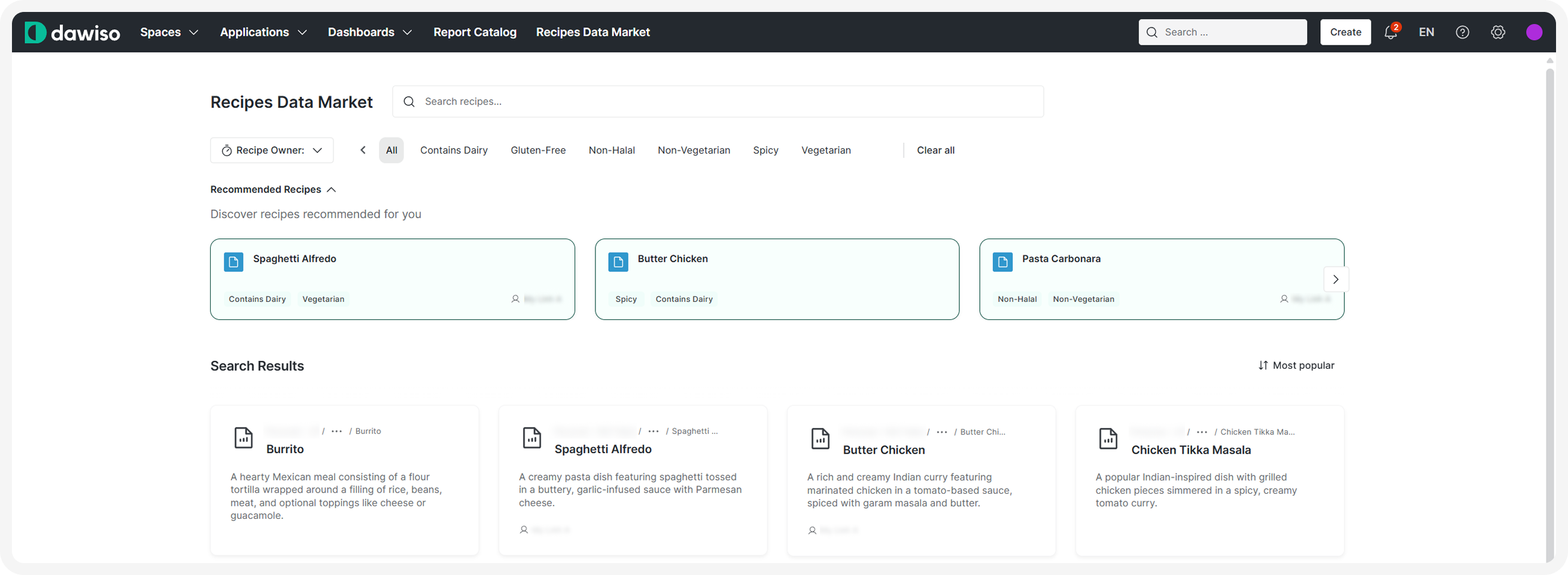
Data Market Page
The page asset defines the visual layout and functionality of the data market interface. It consists of multiple components that work together to provide search, recommendations, and results display.
Page Template
"pages": [
    {
        "key": "",
        "name": "",
        "url": "",
        "orderNumber": 0,
        "iconKey": "",
        "locationKey": "",
        "template": {
            "centerArea": [],
            "settings": {}
        }
    }
],| Property | Description |
|---|---|
key | Unique identifier for the page. |
name | Display name of the page shown on the page and in menus. |
url | URL path where the page will be accessible. |
orderNumber | Order position in navigation menu if there are multiple pages available. |
iconKey | Icon displayed in the navigation menu for this page. |
locationKey | Where the page appears in the UI, e.g., top navigation bar. |
template | Defines the page layout and components. |
Page Components
The Data Market page uses three key components in the centerArea: search component, inline API cards, and normal API cards. In this tutorial, we will show you the configuration usually used for data markets. For the full configuration options, see the dedicated articles.
1. Search Component
Provides the main search input for users to search the data market. For more information, see Search (component).
{
    "componentId": "search#recipe_datamarket",
    "type": "search",
    "title": "template.object.market.title",
    "placeholder": "template.object.market.placeholder",
    "searchFormKey": "search_form",
    "targetDataComponentId": "api-card#recipe_target"
},| Property | Description |
|---|---|
componentId | Unique identifier for this component instance (format: type#key). |
type | Component type: search. |
title | Translation key for the search component’s title. |
placeholder | Translation key for placeholder text in the search input field. |
searchFormKey | Key of the search form to use for filtering and faceting. |
targetDataComponentId | ID of the component that will display search results (in our case, API card). |
2. API Card Inline Component (Recommendations)
Displays personalized recommendations to users in an inline horizontal layout. For more information, see API Card Inline.
{
    "componentId": "api_card_inline#recipe_datamarket",
    "type": "api-card-inline",
    "api": "api/mr-object/recommendations/customizable-overview-filter",
    "headerTitle": "template.recommendation-api-card.header",
    "headerClaim": "template.recommendation-api-card.claim",
    "noDataText": "no_data",
    "targetComponentId": "api-card#recipe_target",
    "onClickOpens": "rightPanelDetail",
    "nameAttribute": "objectName",
    "leftData": {
        "type": "relationTypeKey",
        "value": "cust_recipe_metadata_app_has_dietary_category"
    },
    "rightData": {
        "type": "userRelationTypeKey",
        "value": "cust_recipe_metadata_app_recipe_owner"
    },
    "filter": {
        "objectTypeKeys": {
            "value": [
                "cust_recipe_metadata_app_recipe"
            ]
        }
    }
},| Property | Description |
|---|---|
componentId | Unique identifier for this component instance. |
type | Component type: api-card-inline. |
api | API endpoint that provides recommendation data: api/mr-object/recommendations/customizable-overview-filter. For more information on API endpoints and compatible filters, see Endpoints for API components. |
headerTitle | Translation key for the recommendations section title. |
headerClaim | Translation key for the descriptive subtitle/claim text. |
noDataText | Translation key for message shown when no recommendations are available. |
targetComponentId | Fill this in if you want the inline API cards to disappear when the target component displays search results. |
onClickOpens | What opens when a recommendation is clicked: rightPanelDetail (object detail panel). |
nameAttribute | Attribute to use for displaying the object name in recommendations. |
leftData | Configuration for data displayed on the left side of recommendation cards (e.g., relation count). |
rightData | Configuration for data displayed on the right side of recommendation cards (e.g., user relation). |
filter | Filters to apply to recommendation results (e.g., limit to specific object types). |
3. API Card Component (Search Results)
Displays search results in a card-based layout with multiple view options. For more information, see API Card.
{
    "componentId": "api-card#recipe_target",
    "type": "api-card",
    "api": "api/dashboard/search-object",
    "headerTitle": "template.object.api-card.header",
    "noDataText": "template.object.api-card.no_data",
    "noDataIconKey": "core_recently_viewed",
    "onClickOpens": "rightPanelDetail",
    "sortTypes": [ "name",  "created", "modified", "popularity" ],
    "nameAttribute": "name",
    "secondaryNameAttribute": "48",
    "userRelationTypeKey": "cust_recipe_metadata_app_best_cook",
    "objectPathKey": "objectPath",
    "middleSectionAttributeTypeKey": "core_description_scanned",
    "searchFormKey": "search_form",
    "additionalRelationTypes": [ { "key": "cust_recipe_metadata_app_has_dietary_category" } ],
    "additionalUserRelationTypes": [
        { "key": "cust_recipe_metadata_app_recipe_owner" },
        { "key": "cust_recipe_metadata_app_best_cook" }
    ],
    "favouriteObjectTypes": [
        { "key": "cust_recipe_metadata_app_recipe" }
    ],
    "layouts": [ { "type": "cards" } ]
}| Property | Description |
|---|---|
componentId | Unique identifier for this component instance. |
type | Component type: api-card. |
api | API endpoint for search results: api/dashboard/search-object. |
headerTitle | Translation key for the search results section title. |
noDataText | Translation key for message shown when no results are found. |
noDataIconKey | Icon to display when no results are found. |
onClickOpens | What opens when a result is clicked: rightPanelDetail. |
sortTypes | Array of available sort options: name, created, modified, popularity. |
nameAttribute | Primary attribute to display as the object name. |
secondaryNameAttribute | Secondary attribute or attribute type ID to display below the name. |
userRelationTypeKey | User relation to display on result cards (e.g., owner or assigned user). |
objectPathKey | Object or application path that will be displayed on the card. |
middleSectionAttributeTypeKey | Attribute type to display in the middle section of cards (e.g., description). |
searchFormKey | Key of the search form this component uses for filtering. |
additionalRelationTypes | Array of relation types to display on result cards with their counts. |
additionalUserRelationTypes | Array of user relation types to display on result cards. |
favouriteObjectTypes | Array of object types that can be marked as favorites. |
layouts | Available layout views for results (e.g., cards, list). |
Template Settings
Finally, using the template settings, we can hide UI elements that are displayed by default. For the data market, we don’t want any elements except for our components:
"settings": {
    "componentId": "template-settings#app_overview_settings",
    "type": "template-settings",
    "hide": {
        "attachments": true,
        "changes": true,
        "commentSection": true,
        "concepts": true,
        "editButton": true,
        "favouriteButton": true,
        "hideEmptyAttributesButton": true,
        "shareObject": true,
        "watchingButton": true,
        "workflowStatus": true,
        "likeButton": true,
        "anchors": true,
        "moveObject": true,
        "renameObject": true,
        "removeObject": true
    }
}| Property | Description |
|---|---|
componentId | Unique identifier for the settings component. |
type | Component type: template-settings. |
hide | Object containing boolean flags for UI elements to hide. Each property set to true hides that element. On our page, we hid the following elements to reduce visual distraction: attachments: Attachments section, changes: Change history, commentSection: Comments section, concepts: Concepts/tags, editButton: Edit button, favouriteButton: Favorite/star button, shareObject: Share functionality, watchingButton: Watch/follow button, likeButton: Like button, removeObject: Delete option |