Component description
The relations component configures a group of visual elements that adds and displays relations between objects. The visual appearance is based on the selected elementType.
Minimal JSON
{
  "type": "relations"
}
{
"key": "data_lineage_relations_diagram_generic",
"template": {
"componentId": "template#data_lineage_relations_diagram_generic",
"type": "relations",
"title": "template.data_lineage_object_relations",
"elementType": "diagram",
"diagramTypes": [
{
"type": "diagram",
"metamodelKey": "data_lineage",
"title": "template.relations_data_lineage_diagram",
"isDefault": true
},
{
"type": "object-relations",
"title": "template.relations_object_relations_diagram"
}
]
}
}Example taken from the core package.
Nested properties
| Property | Description | Values | Mandatory |
|---|---|---|---|
type | relations | string | Yes |
attributes | Array of attribute types of target objects that should be displayed in the element. | array | No |
componentId | Unique ID of a component. If left empty, a random string will be generated. Primarily used in patch packages to define the component's position within the layout (template). | string | No |
defaultSort | Default column used to sort the table. | array | No |
diagramTypes | Diagram type. Used for diagram element type. | array | No |
elementType | Type of visual element used to display the relations. For supported element types, see this section. If not specified, grouped-list will be the default value. | string* | No |
filter | Configures filters selecting which relations or objects can be displayed. | array | No |
filterOut | Configures filters selecting which relations or objects cannot be displayed. | array | No |
hide | Hides relations from specifics spaces or applications. | array | No |
isConditional | Determines whether the selection of the relations depends on specific conditions. Used in combination with certain filters. | boolean | No |
isMultiselect | Determines whether the component allows the bulk selection of relations. | boolean | No |
levels | Number of levels displayed that can be displayed. | integer | No |
query | Query for the component. Supported values are: default, distinct | string in (“default”, “distinct”) | No |
settings | Configures the element behavior. | array | No |
startingLevel | Level which is displayed by default. | integer | No |
title | Translation key of the title. Define the key in translations to specify how the text is displayed in the UI. Unlike the name property, if you use a specific string of text for the title, this text will appear with the package key. For example, Comment Section will be displayed as package_key_comment section. | string | No |
values | Array of selected object type relations keys (no other relation type will be displayed). | array | No |
*Supported elementType values
| elementType | Description |
|---|---|
table | Table of all objects related to the current object. 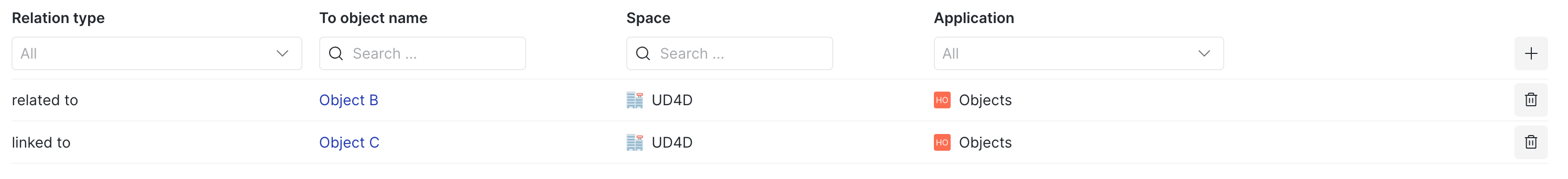 |
static-table | A read-only table of all objects related to the current object. Visually looks the same as table but does not allow adding relations. 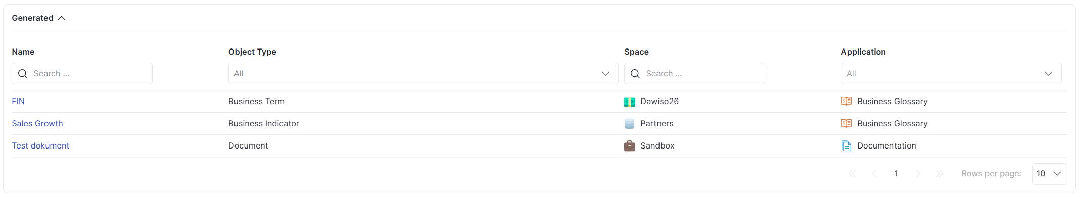 |
grouped-list | List of all objects, grouped by relation type, related to the current object. Default option. 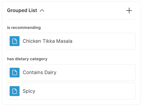 |
static-grouped-list | A read-only list of all objects, grouped by relation type, related to the current object. Visually looks the same as grouped-list but does not allow adding relations. |
simple-relation | List of related objects. Visually similar to grouped-list. 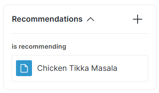 |
diagram | Visual diagram of relations. For more information and examples, see Diagram Types. |
child-relations-table | Table with objects that are related to its child object(s). Visually looks the same as table. |